Saturday, April 10, 2010

Warm and cool... reds

I talked a little before about turning forms with value versus turning form with temperature.  Well, you need a little of both to successfully work with red.  I added a little bit of violet to the reds on the right side of Misty’s core shadow and a little bit of orange to be reds on the left.  I ended up going back and cooling the reds on the right side down even more as the painting progressed.

Get Misty love

If you're working with a character dressed in red, the first thing you must sacrifice is subtlety.  Red is an unforgiving color.  Its value range starts with a medium dark, and only goes darker from there.  You can create beautiful value shifts within that range on your original, but less than a quarter of them will reproduce in print.  Luckily I'm not working here for reproduction, but I still want to take a dynamic approach.  I want to go very dark in my shadows to compensate for the value vampire at is red.

Old-school is the new cool

I have a love-hate relationship with hand lettering.  The first art job I got when I moved to Atlanta for school was assisting a sign painter, and he taught me most of what I know about type and lettering.  This guy was like a redneck Mr. Miyagi, and he taught that hand lettering was the true path to enlightenment.  If that's true then Adobe illustrator must be the express lane.  But, I have to say I agree with him on original paintings.  There's something nice about the slight imperfections of hand-painted lettering on a hand-painted image.  I always thought it's was cool to see hand-painted lettering on thoes old Rockwell illustrations, and it seems to me that there is a little something lost since most comic book original art no longer has word balloons.  And it's always felt like you got a piece of the story as well as the art when the lettering is there.

Movie album

The look I’m going for here is somewhere between a movie teaser poster and a jazz album cover from the late 60s and 70s.  I decided to go with an opaque paint to get that rich silk screened look.  Holbein makes a product called acrya gouache that's perfect for this application.  It's very opaque and the colors dry to a nice matte finish, and it has a pretty impressive color range.  It's a bit like animation cell paint, but it's a little easier to get your hands on.  I thinned the colors down to a milky consistency to give it a slight bit of texture.  Going to flat and opaque here would make things look a little too artificial and cut out, but that texture will tie the background and foreground together.

So where was I?

This is the line art setup stage. Lately I've been handling this stage with pigmented brush markers. They are permanent, easy to control, and come in a good variety of colors. At this phase I look for hard edges created by cast shadows or form against negative space. I also use this period to set up some target darks. This keeps me from going to light and dreamy with my technique. It's also quite a comfort to have a solid drawing you can rely on.

I tried to go too light with lines that identify structures within the form. Like flesh toned lines within the face and the reds on Misty’s costume. These lines generally get blown out with the first or second wash of color, but they help identify landmarks.

Thursday, December 17, 2009

Colored girls


It's always a good idea to preserve continuity with color comps. If you're going to paint in watercolors, you should always do your comps in watercolors. This makes it much easier to match your colors on the finished painting. It's even better to write down color formulas or combinations used to achieve specific colors. The reflective and translucent quality of different mediums can wreck havoc with colors and perception, and this goes double for the computer. You throw in the differences between reflected and projected colors and you're begging for a headache.

So, I did this comp on the computer with a sweet Japanese ink and paint program called SAI Paint Tool. It was fast and so convenient, and it's a great program for tablet PCs. The only real drawback was trying to match colors on the finished piece, and that was a real headache. I wonder why?

The colors needed to be bright but just south of psychedelic. I always thought the 60s made it okay to use bright colors, but when we got to the 80s it had spun out of control. The 70s got it just right, and that was the feeling I wanted. Laura "Colorista” Martin works across the hall from me here at the studio, so I called her in for a second opinion, and after a bit of tweaking you could actually hear the colors sing.

Choose your weapons


Illustrations often key on different aspects of picture making, and I think it's important to recognize those keys as early as possible. It's like setting up a plot line or genre before starting the serious work of writing. In a sense, it's what the painting technique is about.
Your dominant keys are technique, design, color, and storytelling. I want every painting to have some bits of all these elements, but I want to dominate the piece with one or two then downplay the others. If I do a painting about storytelling then I may want to de-emphasize the colors or rendering. This way the storytelling takes center stage and the painting doesn't feel heavy or exhausting to the viewer.

My design here is simple, and there isn't much storytelling beyond the character’s bad ass attitudes, so this is all about color and technique. With a special accent on color.

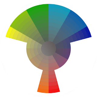
Here's my color range for this piece. I'm not cheating in extra colors here but I'm more splitting my tertiary colors. So I'm using… septiary colors? Not sure if I'm not making that up, but don't try it at home. All my yellows will lean slightly towards green (lemon yellow) and my oranges will push slightly red.
This color range is my Bible for this painting and I will religiously adhere to it.

Editors note: I consider myself an agnostic leaning towards atheism, so I reserve the right to bail at a moments notice.